Food & Wellness
Hikari Matcha
Strategic Positioning and Identity Design for a Matcha Brand
Hikari Matcha is a US-based matcha brand upgraded from an established store. With the rapid growth of the North American matcha market, it is becoming harder to build differentiation solely through Japanese origin or raw material quality.
This upgrade seeks to attract younger consumers and build a more recognizable brand system for future franchise expansion while retaining product advantages.
Insight
In recent years, North American consumer perception of matcha has changed. It is no longer just a small Japanese drink but a symbol of healthy lifestyle and social status.
Meanwhile, many brands remain stuck in traditional Japanese expressions, using terms like Kyoto or Craftsman, which makes differentiation difficult.
The brand needs to shift from selling matcha drinks to a fuller lifestyle expression, making matcha a sunnier, healthier, and more natural daily experience.
" Simply emphasizing raw materials and origin has become increasingly difficult to form long-term differentiation. "
Strategy
" The brand aims to move from a single drink shop to a more complete lifestyle perception. "
In this upgrade, Hikari Matcha expands from a drink brand to a matcha-centric catering lifestyle brand. It no longer only emphasizes the supply chain, but surrounds the lifestyle of young consumers with more emotional and daily recognition.
Compared to traditional Japanese tea brands that are quiet and restrained, Hikari Matcha emphasizes sunshine, vitality, and social attributes. We want matcha to enter a more relaxed, modern environment.
This direction also creates room for future store expansion, dessert extensions, packaged snacks, and branded products.
Identity System
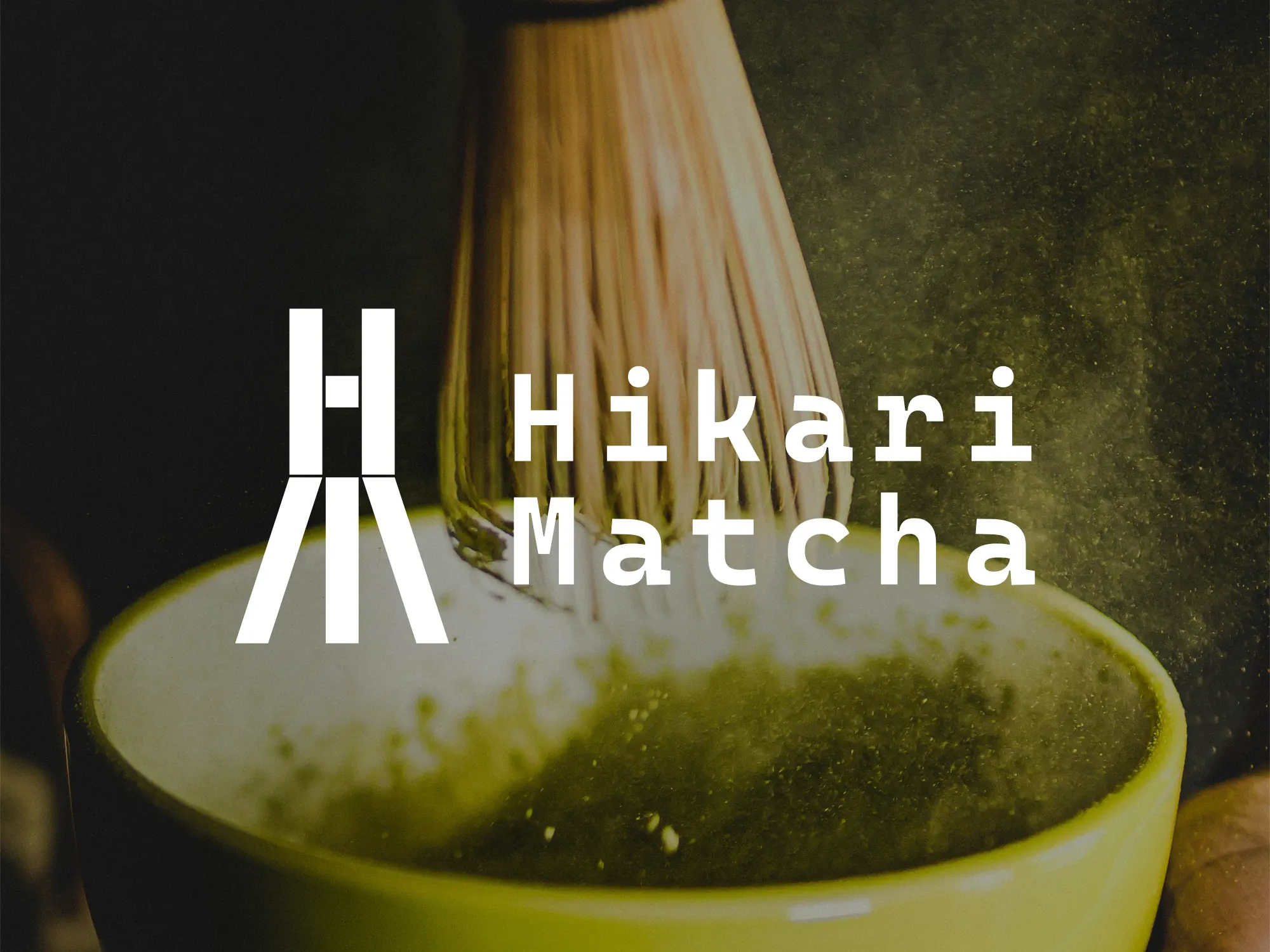
The logo combines the letters H and M, then abstracts them into the structural form of a chasen, the traditional tea whisk. It preserves the cultural link while creating a simpler, more recognizable symbol.
Cascadia Code was chosen as the base typeface because its personality and rhythm make the identity feel more vivid and youthful, especially in social media environments.
The color system is derived from the layered greens of matcha and bamboo, aiming for a natural, fresh, and energetic brand feeling rather than the distance often found in traditional tea culture.