Food & Wellness
Granaia
Visual Identity Construction for an Italian Pasta Brand
Granaia is an Italian brand targeting North American and European markets. It seeks to rebuild the relationship between people and Italian culture in a more modern, relaxed way while preserving traditional craft.
Featuring products made from 100% durum wheat using traditional bronze dies and low-temperature drying, it aims to create a modern dining experience that balances quality with daily life.
Insight
The current Italian food market is dominated by two expressions: classic brands emphasizing family history and mass brands focused on price and convenience.
The former often feels too heavy, while the latter lacks quality and food culture.
Increasingly, consumers want higher-quality meals integrated into daily life, not only nostalgia or convenience.
" There is a lack of brands that preserve traditional craft while fitting modern aesthetics. "
Strategy
" Let traditional craft enter daily life in a more relaxed and modern way. "
The brand uses bronze-die molding and low-temperature drying as its quality foundation.
It avoids the familiar vintage Italian food tropes such as family narratives or rural nostalgia, and instead reorganizes brand expression in a simpler, more restrained way.
Through packaging and visuals, traditional craft is no longer stuck in nostalgia, but becomes a modern way of eating.
Identity System
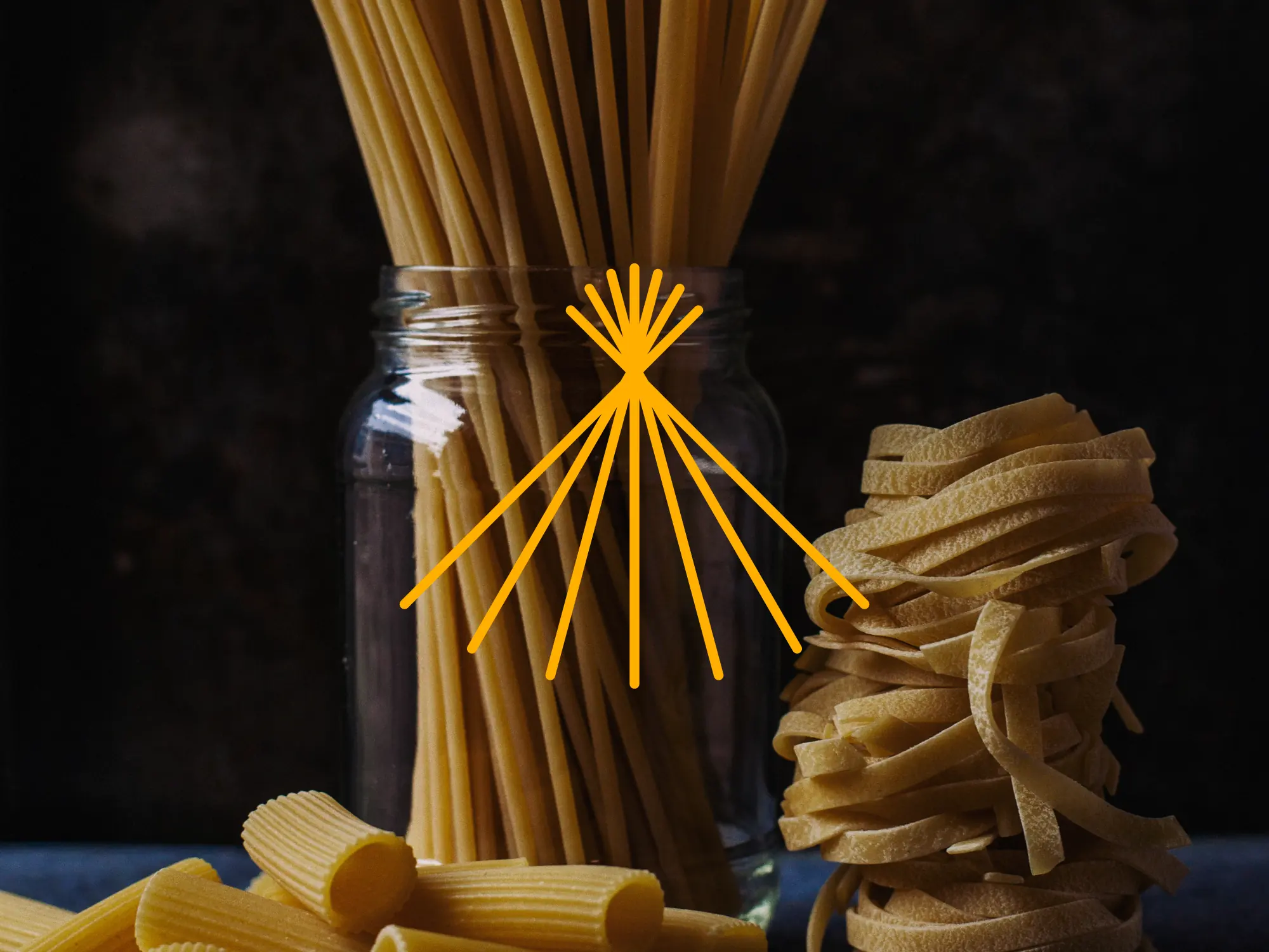
The Granaia logo is inspired by a bundle of pasta while also carrying the imagery of wheat, fields, and sunlight. The outward lines suggest the natural texture of bronze-die pasta and give the mark energy.
The primary color is an orange-yellow close to dried pasta, with slightly higher saturation to build a sun-drenched, healthy atmosphere. Ample white space keeps the system light enough for modern kitchens.
The logo typeface is based on lowercase Catallina, adjusted to retain a vintage temperament with a more rounded structure and looser reading rhythm, softening the heaviness often found in Italian food branding.