Food & Wellness
Fjorel
Brand Identity and Packaging Design for a Nordic Supplement Brand
Fjorel is a Nordic supplement label built around a single principle: natural ingredients, sourced with intention, processed as little as possible.
The brand offers a full range of daily supplements for consumers who want to know exactly what they are taking and why. The challenge was to build an identity that makes this commitment visible before a word is read.
Insight
The supplement industry has a trust problem. Shelves are crowded with products making overlapping claims in packaging designed to signal health rather than deliver it.
Consumers who genuinely read labels have learned to ignore the packaging entirely.
The deeper issue is that most supplement brands are built around a single hero product, so when the range expands, the visual system fractures.
" The visual language of the category has become so predictable that it no longer communicates anything. "
Strategy
" The brand stays recognizable across the range not because everything looks the same, but because the same logic governs every decision. "
The strategic direction was to build Fjorel around a brand conviction rather than a product claim. Not our fish oil is the best, but we add nothing, we hide nothing.
That principle applies equally to every product in the range, which means the identity can hold across SKUs without fracturing.
Visually, the solution was restraint. A deep Nordic teal anchors the brand, while each product line keeps its own supporting palette.
Identity System
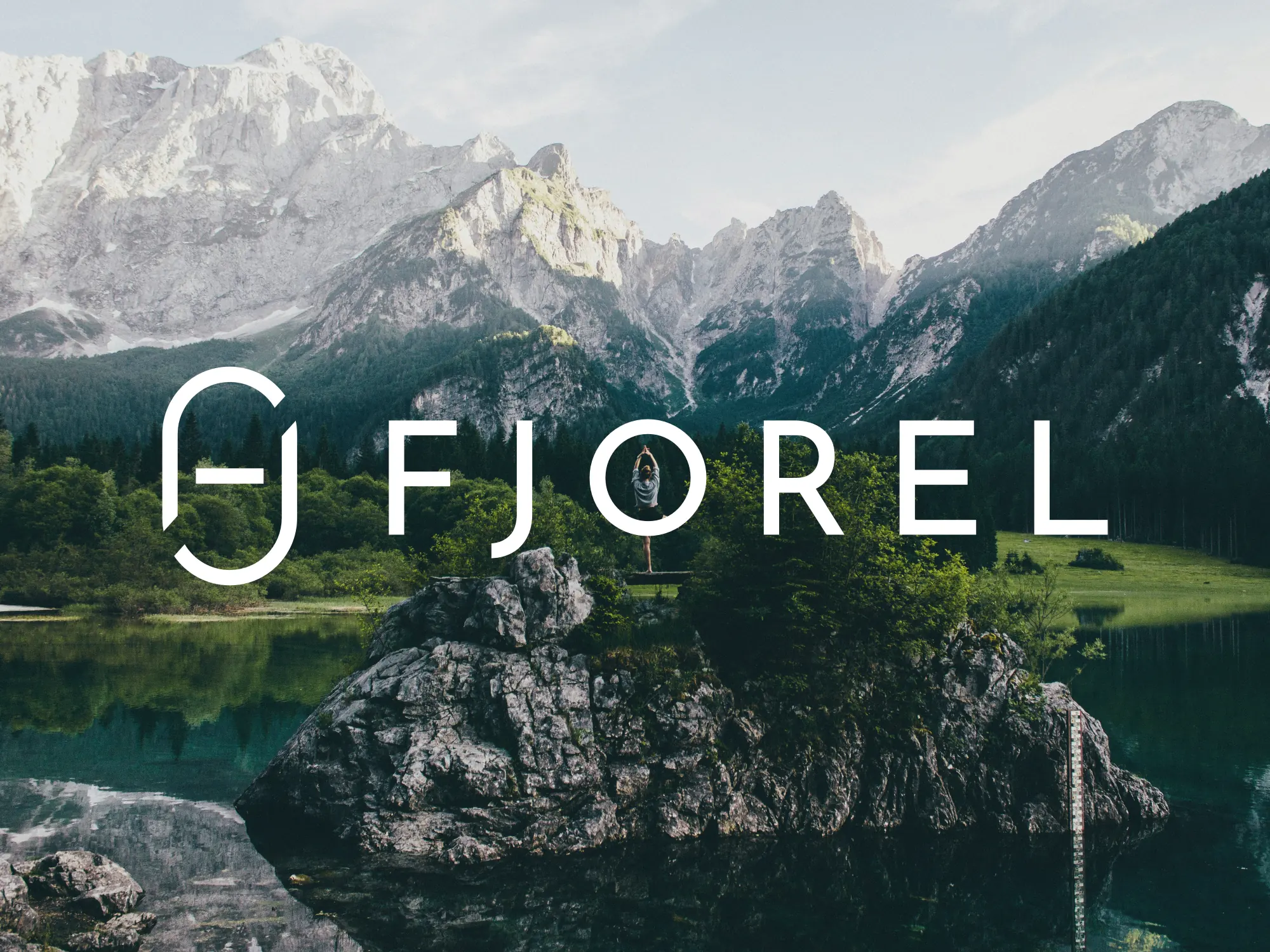
The Fjorel logomark is built from the brand’s initials. F and J face each other, their curves meeting to form a single enclosed capsule shape. It is simultaneously a monogram and an immediate reference to what Fjorel makes.
The wordmark sets FJOREL in Josefin Sans, all caps, positioned beneath the logomark. The contrast between the enclosed monogram and the open wordmark gives the system both precision and calm.
The primary color is a deep Nordic teal, referencing cold water and undyed natural material rather than the generic greens of the wellness category. Used as an accent, it signals the brand without overwhelming the product.