Culture & Institutions
Bonart
Visual Identity Upgrade for a Premium Travel Agency
Bonart belongs to a high-end travel group with over 20 years of experience, specializing in boutique small groups and bespoke travel services.
As competition in the premium market intensifies, the original brand image struggled to differentiate itself from homogenized products. This upgrade seeks to retain the trust of core clients while attracting a younger generation of travelers.
Insight
Many travel brands emphasize where to go, but true memories often come from subtle feelings: changing landscapes through the window, the light after long hours of transit, or the first sight of a foreign view.
Bonart is better suited to a restrained, stable temperament rather than one emphasizing efficiency and price.
The brand should not rely on destination volume or visual stimulus, but on long-term memory built around observation, process, and the experience itself.
" Travel itself is actually a change in the way we see. "
Strategy
" It should not create hype like a traditional travel agency, but act as a companion helping users re-perceive the world. "
Bonart’s core competitiveness lies in the control of travel rhythm and the quality of the experience. Positioning therefore moves beyond premium service toward being a provider of deep travel lifestyles.
Unlike one-size-fits-all strategies common in the industry, Bonart focuses on boutique groups and long-term companionship. This creates a clear distinction from the mass market focused on efficiency and price.
The brand aims to de-emphasize the immediate consumption feel of traditional tourism and build a travel relationship based on long-term trust and repeat choice.
Identity System
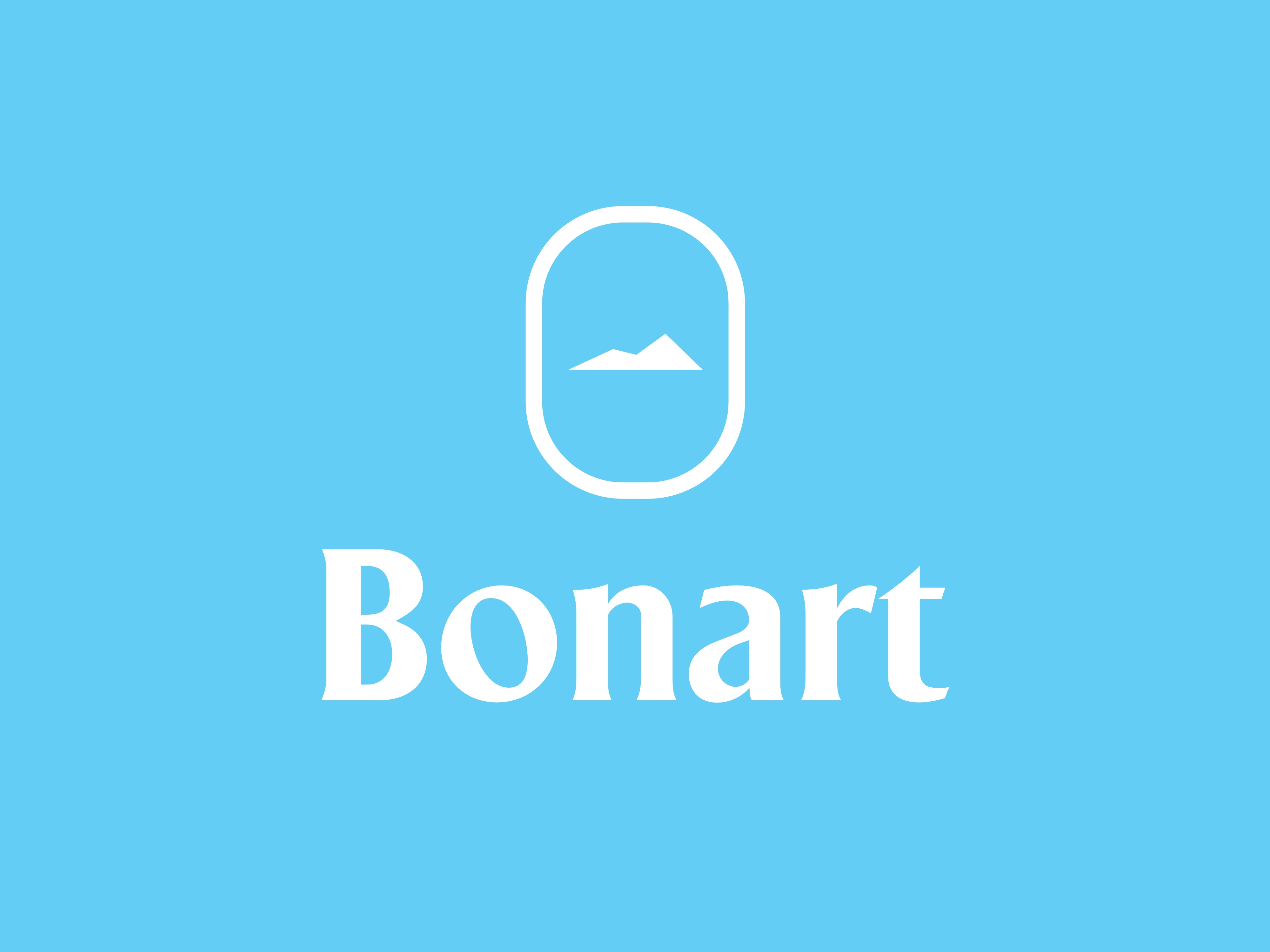
The visual system centers on the view through a window. The logo uses the oval structure of aircraft or transport windows as a base, embedding a white mountain silhouette to unite seeing the landscape with the travel process itself.
The Bonart wordmark uses the clean, modern Gilland typeface, making the name itself the core of identification while reducing visual noise. The letterforms were adjusted to preserve a premium tone with stable rhythm.
In color and layout, the brand chose calm natural tones and a white-space-led structure. The goal is to align with deep travel and long-term experience rather than the high-stimulus emotional expression common in tourism.